This page includes examples of all components shared across our docs files. See them all in action in the built page or view the source to see how use them.
h2 Heading
Text under a second-level heading.
h3 Heading
Text under a third-level heading.
h4 Heading
Text under a fourth-level heading.
h5 Heading
Text under a fifth-level heading.
h6 Heading
Text under a sixth-level heading.
Horizontal Rules
Typographic replacements
© ® ™ ¶ § ±
→ ←
Ellipses: test.. test… test… test?… test!…
Dashes: – —
Quotes: “Smartypants, double quotes” and ‘single quotes’
Emphasis
This is bold text
This is italic text
Strike through
Lists
Unordered
- Create a list by starting a line with
-. - Sub-lists are made by indenting 2 spaces:
- Keep going, just with the indentation the same for each list:
- Next item
- And another
- And another
- Keep going, just with the indentation the same for each list:
- Very easy!
Ordered
The first item in the top-level list
The second item in the top-level list
- The first item in a nested list
- The second item in a nested list
The third item in the top-level list
Items with multiple paragraphs
The first paragraph.
The second paragraph.
Another item.
Code
Inline code
Code blocks
Sample text here...
Syntax highlighting
const foo = bar => ++bar;console.log(foo(5));
Callouts
You can use various callouts using properties from our Alert component.
Tables
| Package | Description |
|---|---|
| orbit-components | All our React components along with API documentation. |
| orbit-design-tokens | All visual UI attributes available as tokens. |
Aligned columns
In addition to the default of left alignment, columns can also be right or center aligned. Set alignment with colons in the header row.
| Option | Description |
|---|---|
| orbit-components | All our React components along with API documentation. |
| orbit-design-tokens | All visual UI attributes available as tokens. |
Links
External links
Internal links
Automatically converted link https://github.com/kiwicom/orbit
Images
Plain Images

Image with caption
Images by reference
You can also add images with a footnote-style syntax.
Use a reference at the end of the document to define the URL location.
Figma image
TODO.
Image container
Alignment
Size
Small
Medium
Large
Border
Definition Lists
Orbit
An open source design system for your next travel project.
Design system
Components, styles, and patterns to create beautiful consistent designs at scale.
Fancy links
Tiles that span the text area and show icons the links.
Choose from the existing icons or import your own.
Guidelines
Guideline do
Guideline don’t
Don’t use Product colors to highlight information
Because Product colors are used for actions, it may cause confusion when they’re used to highlight some information or text.
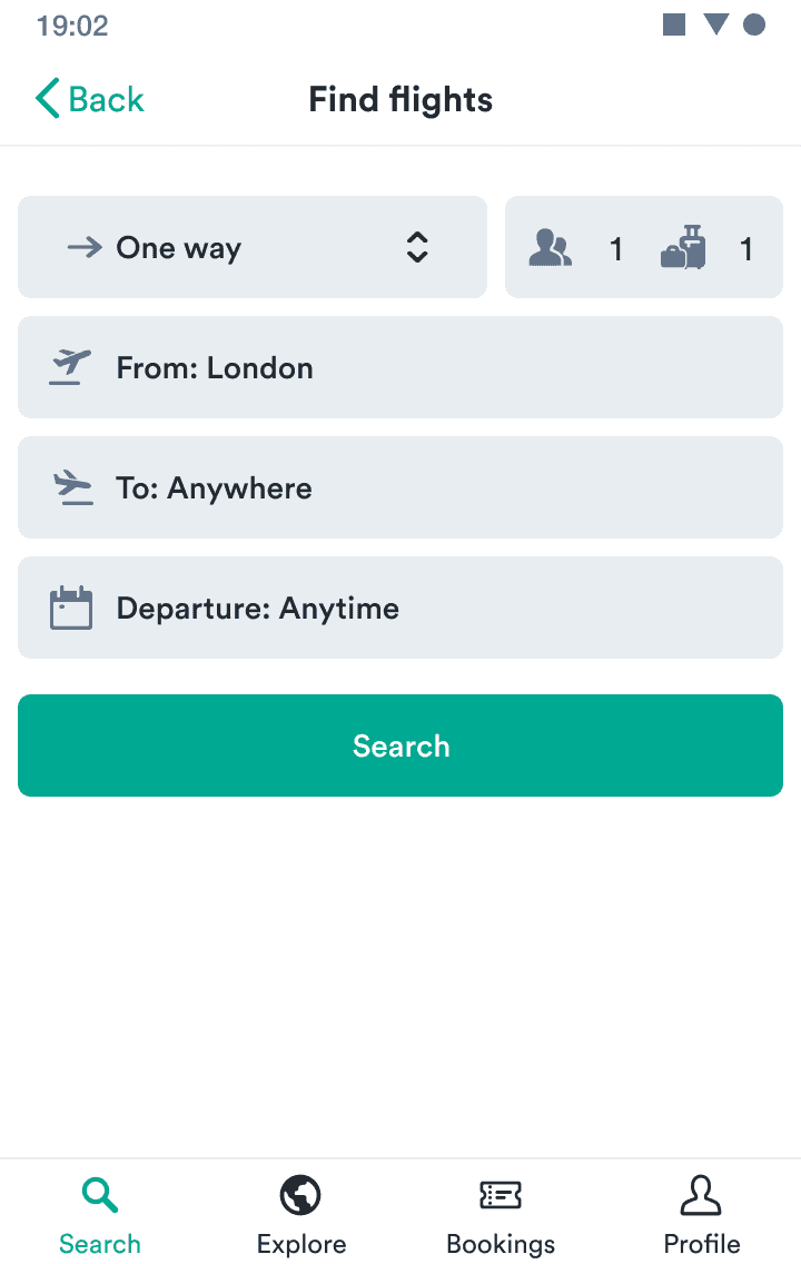
Guideline with one image
Have one primary action
Every screen should have only one button that represents the most important action: leading the user to the next step.
Guideline with only image and title
Don't combine with text link
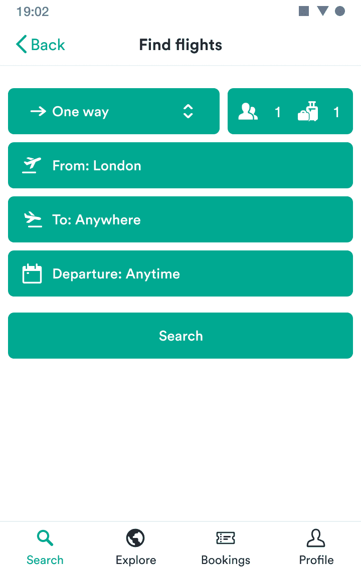
Guideline with two images
Have one primary action
Every screen should have only one button that represents the most important action: leading the user to the next step.
Do
Don't
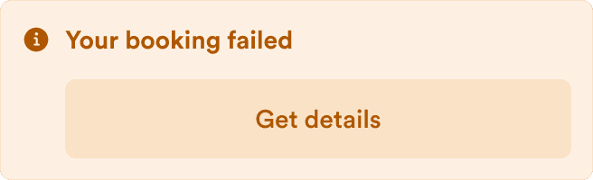
Guideline images with separate descriptions
Do
Ensure there’s only one primary action on each screen.
Don't
Don’t fill up the screen with primary actions.
Do
Ensure there’s only one primary action on each screen.
Don't
Don’t fill up the screen with primary actions.
Guidelines side by side
Do
Don’t
Do
As the passenger, it’s your responsibility to ensure you have the correct visas and travel documents for your trip.
You should carefully check which countries you’re transiting through before making your booking. A visa is generally required even for transit or rechecking your baggage.
Don’t
- As a passenger, it’s your responsibility to ensure you have the correct visas and travel documents for your trip.
- You should carefully check which countries you’re transiting through before making your booking.
- A visa is generally required even for transit or rechecking your baggage.
Inline token
TODO.