When to use
- To present many options where only one can be selected.
- To keep long lists of options from being overwhelming.
- To fit multiple options into a small space.
When not to use
- When you have only a few options and enough space—use a radio.
- When users can select more than one of a few options—use a checkbox.
- When users can add and remove from many options—consider an input field with tags.
- For structured options with enough space—use a list choice.
Component status
Figma | React | iOS | Android |
|---|---|---|---|
Released | Released | Released | Released |
Content structure
Behavior
Use for many options
Selects work well to present many different options in a compact unit. This way users don’t have to scroll through tens of options to find what they’re looking for.
When you have only a few options so users aren’t overwhelmed by them, it can help to present them all at once, such as with radio buttons.
Content
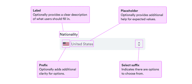
Use labels
Labels serve to clearly present what’s expected. They’re especially important for people who don’t see other visual cues. But they also help everyone know exactly what to enter.
For the label, use short descriptive phrases, ideally nouns that make the request clear. See our patterns for form labels for some examples.
Use error and help messages
For more complicated fields, sometimes labels aren’t enough. You want to include any necessary information as clear as possible to help users complete the fields.
Use help messages to guide users before they enter anything and clear calm error messages when there’s a problem with what they entered.
Remember that such messages are likely to invoke negative feelings, so be positive and focused on solutions to any problems.
Error and Help messages
Include placeholder examples
When you have additional information or helpful examples, include placeholder text to help users along.
Remember that placeholder text is visually less important, low in contrast, and disappears once users enter anything. So do not include anything necessary to complete the field.
Look & feel
Background color and borders
See why background and borders for fields differ between app and website versions.