When to use
- You have an action associated with a section of content.
- Your structured content should lead to the next step in the user flow.
When not to use
- With information without a related action—use a card.
Component status
Figma | React | iOS | Android |
|---|---|---|---|
Planned | Released | Released | Released |
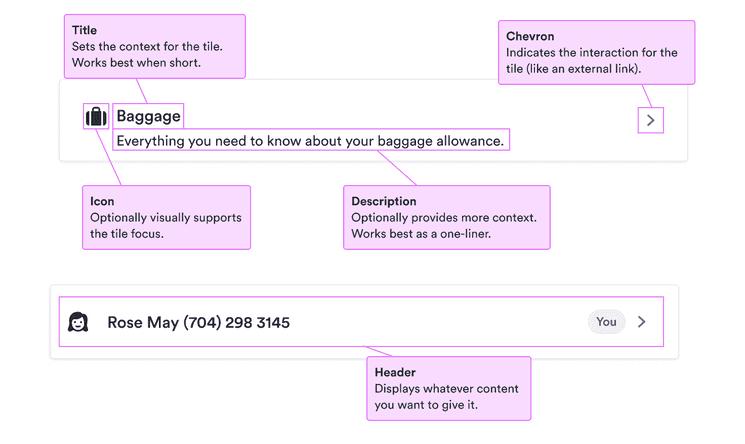
Content structure
Behavior
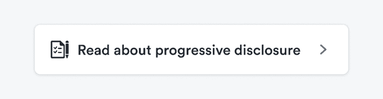
Make the action clear
Tiles should be associated with a single action the user can take. You don’t want surprise users by jumping them into a different context without warning.
So if your action is, say, taking users to a different site where they can read more information, provide icons and other cues to make it clear what will happen.
Do
Show the action.
Don't
Don’t leave users guessing what might happen.

Content
Keep descriptions for extra information
Users sometimes skip descriptions so make sure there’s nothing essential in them. If you need to say something really important, use an informational alert.
Look & feel
Maintain visual hierarchy
Tiles are open to any content you want to put into them. If you're putting a heading into a tile, we recommend using the tile title, which was designed for this purpose. Or at least use the same style of heading to keep the overall visual hierarchy.
Using different styles can create conflicting visual messages, especially if you're using multiple tiles on the same screen.