Overview
Buttons communicate actions that users can take. They are typically placed throughout your UI, in places like: Dialogs, Forms, Toolbars, etc. Buttons help users to perform tasks or trigger processes.
Usage of the component
To indicate primary action.
When you need to make the action look distinct enough.
When you need to fill up the space to match the rest of UI.
You want to offer a less important action or save some space — use a button link.
To make text inside paragraphs or lists actionable — use a text link.
So users can sign in using a social service — use a SocialButton.
Component playground
Look & feel
Component structure
- IconLeft
Optionally visually supports button visibility.
- Label
Describes main action. Works best when short. All labels use sentence case.
- IconRight
Optionally shows the action for the button (expandable, link, etc.).
Button types
Buttons come in three sizes (large, normal, small) and three types (primary, secondary, critical). Two of these types (primary and critical) also have subtle versions in lighter shades to show actions that don’t draw as much attention.
Primary button
Primary buttons are the most important buttons and should be used for the main call to action on the page.

Primary subtle button
Primary subtle buttons are less prominent than primary buttons and can be used for less important or repeating actions.

Critical button
Critical buttons are used for urgent or important actions, such as confirming a destructive action.

Critical subtle button
Critical subtle buttons are less prominent versions of critical buttons and can be used for less important actions like initiating a destructive flow.

Secondary button
Secondary buttons can be used for actions that are not the primary focus of the page.

Button hierarchy
Every screen needs a clear visual hierarchy of buttons and other interactive components. Primary buttons are best for the single primary action on the screen. Critical buttons work for destructive actions — actions users can’t take back. All remaining actions can be Primary subtle buttons, Secondary buttons or Tertiary buttons — mostly ButtonLink or TextLink.
You don’t have to use every step of the hierarchy - you can skip a level if there’s no use for it in the context of a screen.
Guidelines
Order actions by their importance
If everything looks important, then nothing is important.
—Patrick Lencioni
Users need to be certain of what action to take next. Once you’ve identified which actions are the most important at the moment, you can indicate importance through type, size and variation.
Have one primary action
Every screen should have only one button that represents the most important action. It leads the user to the next step.
Do
Don't
Show importance hierarchy
If you have multiple actions on one screen, use different button types and sizes to show different levels of importance.
Do
Don't
Use ButtonLinks in native design
Smaller screens mean less space and using too many subtle or secondary buttons would make the screen look heavy and cluttered. Use ButtonLinks instead - they occupy less space but still look actionable. If you need to align the ButtonLink with content, use compact variant (it has no padding on left and right).
Avoid disabled buttons
Many designers want to show users that actions will be possible in the future, so they end up using disabled buttons to show potential actions. Or they disable actions based on current context, but such buttons often end up confusing users about what’s possible.
Instead, try to focus on using progressive disclosure to show them only the actions they should take right at the moment. Then when it’s possible for them to take action, you can show them more buttons, or let them take the action and show error message to explain why it failed (such as sending incomplete form).
If you need to use a disabled button, always make it clear how users can activate it, such as with a tooltip.
Do
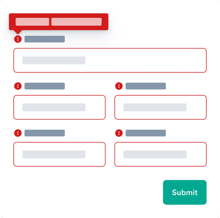
Let the user send incomplete form and use error messages to explain what is wrong.

Don't
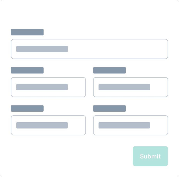
Avoid using disabled button as it doesn’t provide proper explanation to the user.

Use actionable text
It should be clear from the button text exactly what happens when the user interacts with it. The labels should be actionable, such as “Add passenger” and “Book for (price)“.
Avoid long explanations in the button text. The text should be short and clear. If additional explanation is needed, add it above the button as text.
See examples for how to make actions clear.
Do
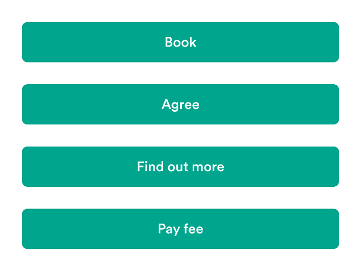
User short and clear labels.

Don't
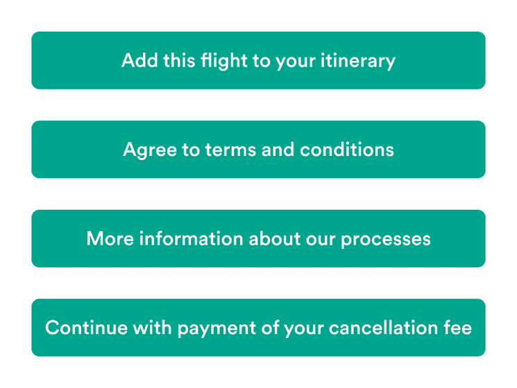
Buttons shouldn’t contain more than 1-3 words.

Buttons with icons
Buttons with icons are great when you need to draw more attention to the action. Icons add additional context and makes the buttons more easy to scan.
But it’s essential to not overuse these buttons. If everything is grabbing attention, things usually get messy.
Right icons should only be directional
They can help explain what happens when the user interacts with the button. An icon (with an aria-label) makes it easier to know if the user is taken elsewhere.
