When to use
- For necessary actions outside the main flow.
- When the action doesn’t benefit from the context of the current screen.
- To interrupt the flow and force attention.
When not to use
- When you have only a single simple action—use a dialog.
- For little information that doesn’t disrupt the main flow—use a popover.
- For a temporary message without actions—use a toast.
Component status
Figma | React | iOS | Android |
|---|---|---|---|
Released | Released | N/A | N/A |
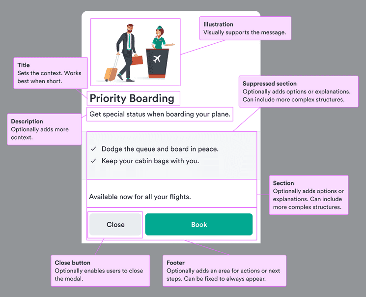
Content structure
Behavior
Open on user action
Modals disrupt the main flow. If they come as a surprise, they’re more likely to be dismissed. Only open a modal after the user has taken an action so it’s clear why it was triggered.
Content
Structure content
Modals are flexible enough to include many types of information. If you’re including multiple types or multiple examples of the same type, structure the information to make it easy for users to scan.
You can use modal sections to add structure to the modal and even, if your content can be logically grouped, include cards to group the information even further.
For example, if you have options to offer for each segment of a trip, you can use modal sections for each sector (such as inbound and outbound of a round trip) and cards inside them with card sections for each segment.
Direct user with the title
A modal title sets the context for everything inside and also stays fixed at the top if the modal scrolls down.
So the title should make it clear what the modal relates to and what actions might be expected of the user. Keep it short and focused on either an action (verb) or a category (noun).
Do
Don’t
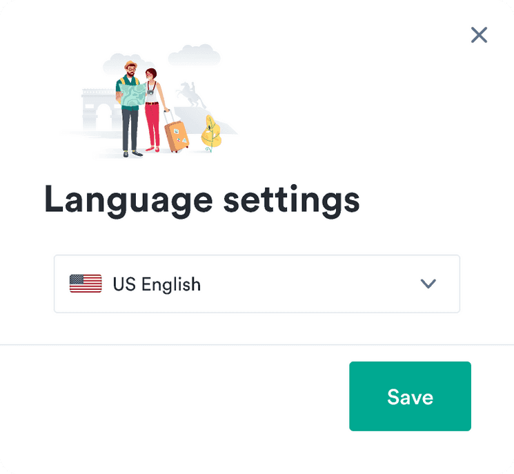
Allow users to close
Users want to feel in control of their actions. Since modals act as interruptions, they can invoke negative feelings in users. Make sure users feel in control by offering them a clear option to close the modal and get back to the main flow.
You should try to match user expectations for the given platform. Responsive and native modals should always include a close button in the footer.
Desktop modals should include a close button in the upper right and (unless you need an explicit close, such as for cookie consent) the option to close the modal by clicking the overlay. Optionally include a secondary button in the footer.
Mobile
Do
Don't
Desktop
Do
Don't

Look & feel
Modal sizes
Modals come in various sizes. These set the maximum width a modal can have on large screens.
| Size | Width |
|---|---|
| extraSmall | 360px |
| small | |
| normal | |
| large | |
| extraLarge |