When to use
- To show selected options that can be added and removed.
- To add interactive labels.
When not to use
Component status
Figma | React | iOS | Android |
|---|---|---|---|
Released | Released | Released | Released |
Content structure
Behavior
Use to organize content
Tags work well at displaying organization in a small space. Use them to show labels, categories, and other taxonomy to show the structure of your content.
Use to filter searches
With small screens, you don’t want to take up a lot of space with all of the options for filtering search results. Use tags to add progressive disclosure to your filters.
Tags allow you to show the category of filter in a small space. Their state lets users quickly see if the filter is applied and clear it.
Content
Keep it simple
Tags are small and can’t contain much information. They’re great for organizing and providing cues for what’s been selected. But you can’t fit a lot into that space.
If you have more information to display, use another component.
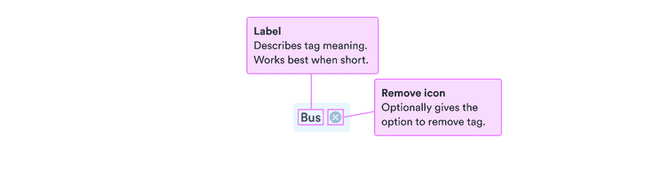
It’s also best to avoid cluttering up tags with too many visual cues. Unless it’s necessary, try to keep tags as text only.
Look & feel
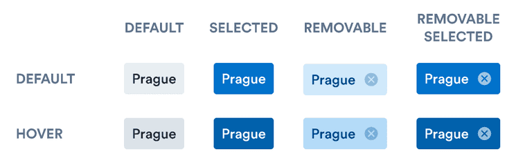
Hover
Because tags are interactive, they darken on hover/focus. This shows users that they can do something by interacting with the tag.
Color
Tags have two states: default and selected. When a tag has been selected (such as when a filter is applied), it becomes darker to draw more attention.
Tags that are removable are BlueLight as default. This helps distinguish them as more interactive. It also helps users see the possibility to remove the tag by clicking the close button.