When to use
- To provide visual context.
- To lead users to the next step in a flow.
- With all essential information in text to be accessible to everyone.
When not to use
- For visual context for specific airports—use an airport illustration.
Component status
Figma | React | iOS | Android |
|---|---|---|---|
Released | Released | Released | Released |
Content structure
Content
Present info nonvisually
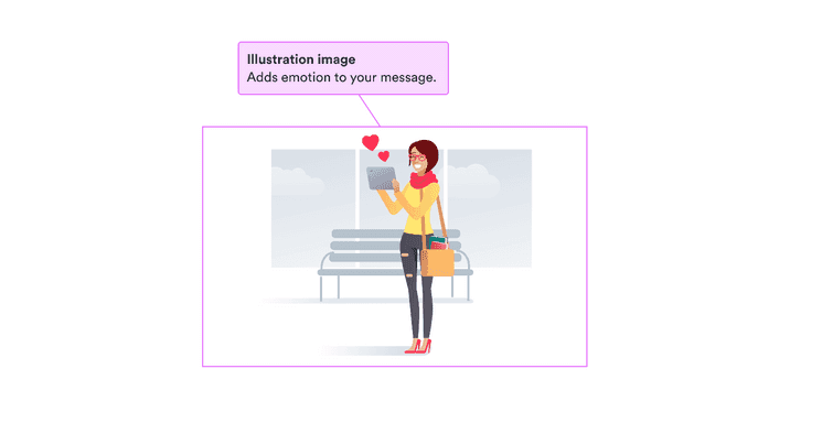
Illustrations can add a lot to your designs. So you need to make sure everything necessary is presented to people who don’t see the illustration as alternative text.
Meaningful alternative text includes the context and function of the illustration. Make sure everything you want users to know to continue in the flow is available to them.
You can include alternative text through means like the alt attribute.
Or you can present necessary alternative text next to the illustration
as text or headings,
in which case you can set the alt attribute to an empty string.
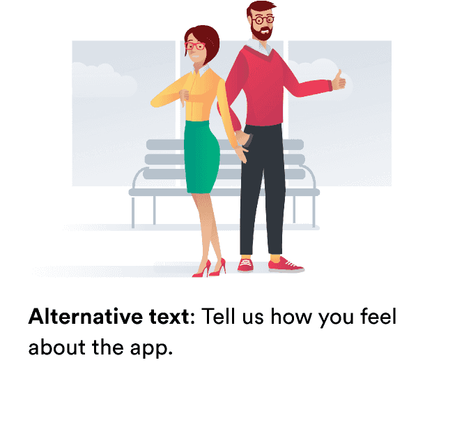
If an illustration is only for decoration, leave the alternative text blank. Providing a description just gives users extra information that doesn’t help them.
Do
Use meaningful alt text.
Don't
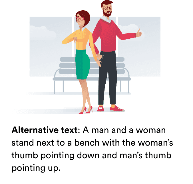
Don’t include unnecessary information that distracts from the main idea.
Look & feel
Illustration types
You can set two things about illustrations. The first is the illustration itself, which you can choose from the complete list of illustrations.
The second is the size. We have five different sizes to offer, which are based around the maximum height of the illustration.
- Extra small (90px)
- Small (120 px)
- Medium (200px)
- Large (280 px)
- Display (460 px)
Available illustrations
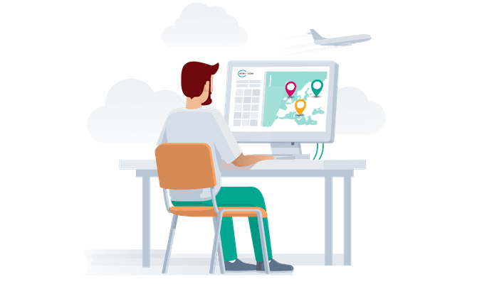
AppKiwi

Accommodation

AirHelp

AirportShuttle
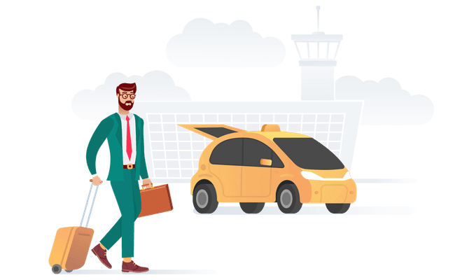
AirportTransport
AirportTransportTaxi

Ambulance

AppQRCode
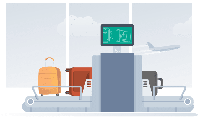
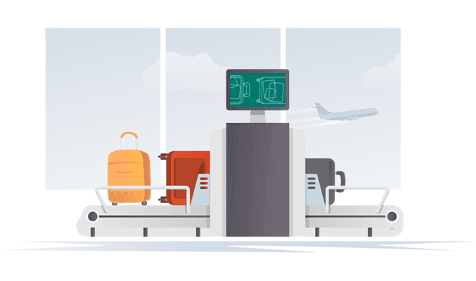
BaggageDrop

Boarding
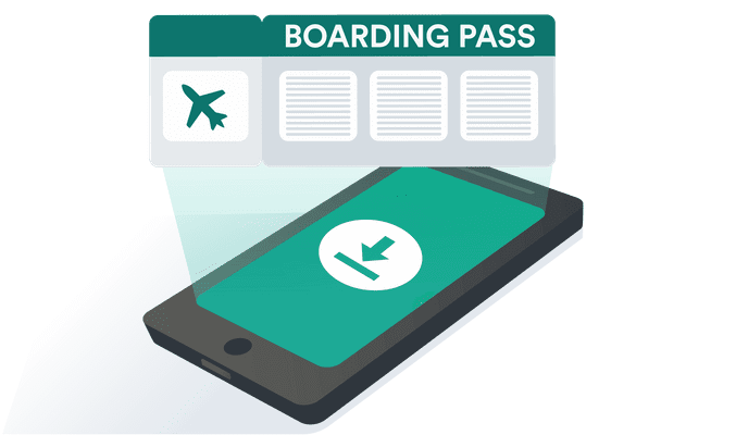
BoardingPass

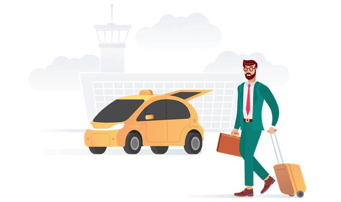
BusinessTravel

CabinBaggage

Chatbot
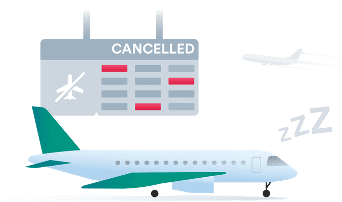
Cancelled

CompassCollectPoints

CompassDemoted

CompassEmailAdventurer

CompassEmailCaptain

CompassEmailPromoted

CompassEmailPromotedCaptain

CompassEmailScout

CompassPoints

CompassSaveOnBooking

CompassTravelPlan

Damage

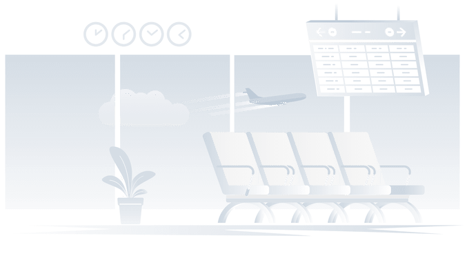
DepartureBoard

DepartureBoardBadge

DepartureBoardLounge
DesktopSearch

EnjoyApp

Error

Error404

EVisa

FastBooking

FastTrack

FastTrackMan

FareLock

FareLockSuccess

Feedback

FlexibleDates

FlightChange
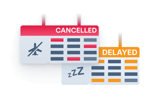
FlightDisruptions
GroundTransport404

Help

Improve

Insurance

InviteAFriend

Login

Lounge

Mailbox

Meal

MobileApp

MobileApp2

Money

MusicalInstruments

NetVerify

NoBookings

NoFavoriteFlights

NoFlightChange
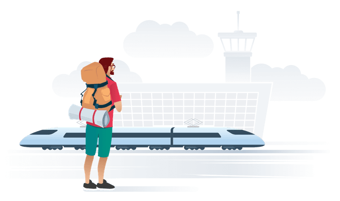
Nomad

NomadNeutral

NoNotification

NoResults

Offline
OnlineCheckIn

OpenSearch
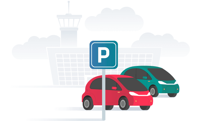
Parking
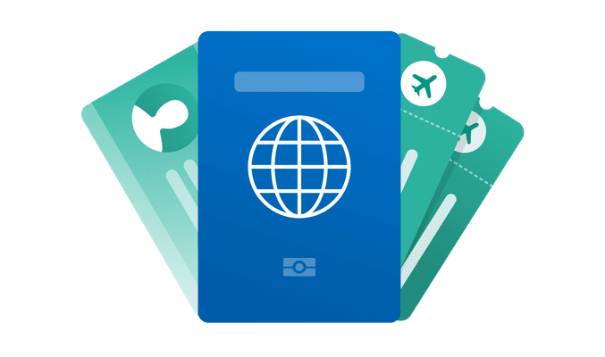
PassportUpdate

Pets
PlaceholderAirport

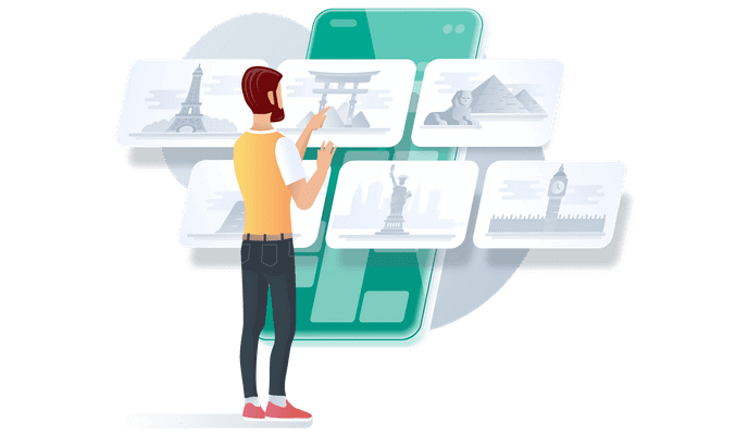
PlaceholderDestination

PlaceholderHotel

PlaceholderTours

PlaneAndMoney

PlaneDelayed

PriorityBoarding

Rating

ReferAFriend

RentalCar

Seating
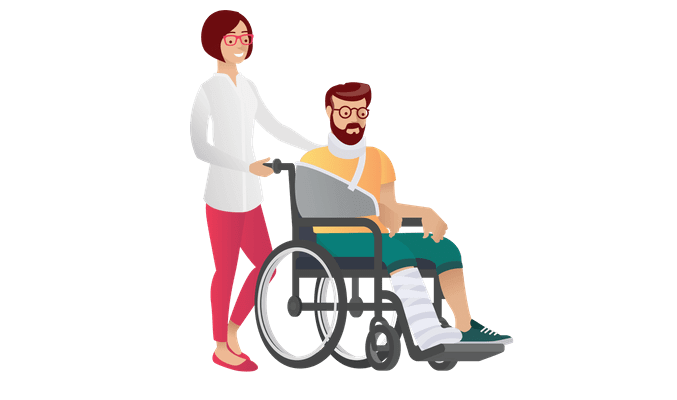
SpecialAssistance

SportsEquipment

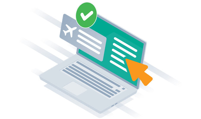
Success

TicketFlexi

Time

TimelineBoarding
TimelineDropBaggage

TimelineLeave

TimelinePick

Tours
Train
TransportBus
TransportTaxi
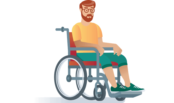
Wheelchair

WomanWithPhone