When to use
- To highlight special offers that require users to opt in.
- To attract attention with an illustration, present clear context, and offer a clear action.
When not to use
- When the content has a different structure and a single action—use a tile.
- When the content has structured groups but no action—use a card.
Component status
Figma | React | iOS | Android |
|---|---|---|---|
Designing | Released | N/A | N/A |
Content structure
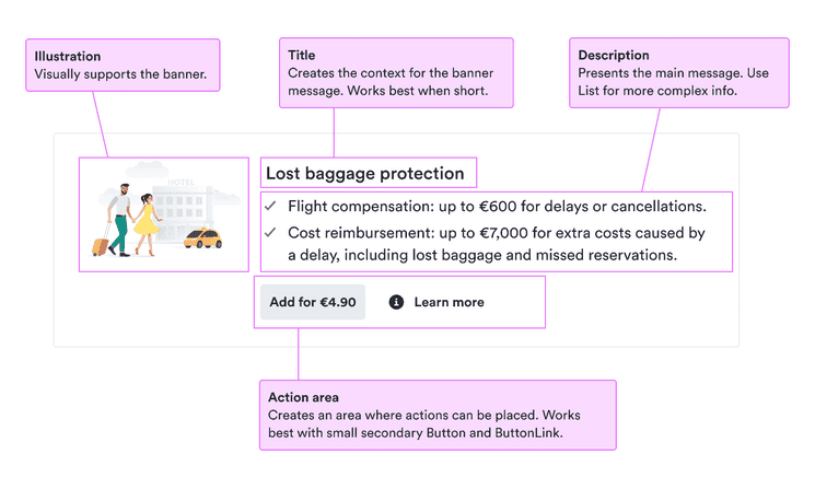
Content
Keep title focused
Users scan the banner to get a quick idea of what’s involved. Make sure the title shows them at a glance what benefit they gain by taking advantage of the offer.
Do
Don’t
Structure information
Callout banners need to get users’ attention quickly. So don’t include a wall of text describing the pros and cons of your offer.
Instead, structure the information with something like a list so users can scan it quickly.
Support with an illustration
Illustrations in callout banners can help add an emotional pull to the message. But these illustrations are just for decoration. This means they don’t need to have alternative text embedded in the image.
Instead, focus on making the title and any other text clear on their own so the message of what to do is accessible to everyone.
Make the action clear
Whether you’re using an action component or have the whole callout banner as actionable, you want users to know how to take advantage of the offer.
Follow the guidelines for actionable button text so users know what to expect and how to get it.