When to use
- To show how many notifications a user has.
- To show simple information that doesn’t require interaction (such as the type of transport).
When not to use
- For anything longer than a very short number or one icon—use a badge.
- To include an action—use a button (a circled button has a similar look with an action).
Component status
Figma | React | iOS | Android |
|---|---|---|---|
Designing | Released | Released | N/A |
Content structure
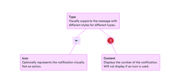
Content
Limit content
Notification badges are very small and circular. This means they can’t hold much content. Use only an icon or a number no more than 2 digits.
Include nonvisual info
When you’re using only an icon for the notification badge, make sure to include the same information nonvisually so even people who don’t see the icon get the same message.
Look & feel
Choose type based on urgency
We have two types of notification badges with different backgrounds: info (BlueLight) and critical (RedLight). They each express a different feel, so choose a color based on how urgent the notification is.
- Info: Subtle, useful for counters. Use when you just want to show users that there is something to see but action isn’t necessary (such as a wish list).
- Critical: Grabs attention. Use when the notification requires real action from the user.