When to use
- To call attention to details in a way that makes it easy to scan.
- To present information, such as status.
When not to use
- If there’s an interaction (such as add/remove)—use a tag.
- If the entire message has an associated action—use an alert.
- For a circled badge for notifications—use a notification badge
Component status
Figma | React | iOS | Android |
|---|---|---|---|
Released | Released | Released | Released |
Content structure
1. Icon (Supports the label)
2. Label (Works best when short)
Behavior
Display static info
Badges are indicators of static information. They can be updated when a status changes, but they should not be actionable.
When you have extra information to display, it’s possible to include a simple interaction, such as displaying a tooltip on hover. When doing so, make sure it’s clear that the interaction is there.

Support with icons
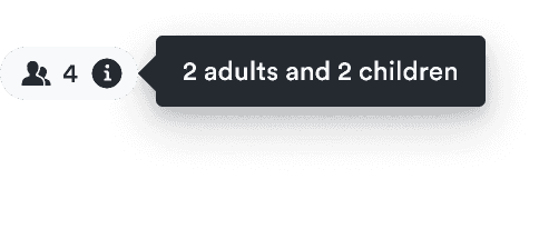
With such small space to convey a message, visual cues can help users understand the idea more quickly. Use icons to display more information in a smaller size, such as what form of transport is included.
The badge can be only an icon. Just be sure to keep it accessible by giving it a label for people who don’t see the icon.
Use icons only on left
Icons connected to the badge meaning should be displayed on the left.
Do

Don't

Use icons on the right only when that icon relates to there being further explanation of the label (such as to signal there’s a tooltip).
Content
Keep it short
Badges are small and can’t contain much information. They’re great for indicating status or how much of something is selected. But you can’t fit a lot into that space.
If you have more information to display, use another component. To keep the UI uncluttered, you can choose one that supports progressive disclosure, such as a tooltip. This can wrap text or even a badge.
Keep badges short
Use progressive disclosure for other information.
Do
Don't

Look & feel
Badge types
There are six basic types of badges. All except white badges have an inverted variant for use with different backgrounds.
Neutral badges
Neutral badges present information without adding any emotion. They’re useful when the information isn’t so important to the user’s main flow.
White badges
White badges are useful when presenting neutral information within a dark context.
Info badges
Informational badges help to highlight some information as particularly important. They draw attention to the badge without stating whether it was positive or a potential problem.
Success badges
Success badges help to highlight something desirable has happened or will happen. You can use them in situations like a confirmation of a user action (such as booking a trip) or potentially attractive options (such as free baggage).
Warning badges
Warning badges highlight information that might have a negative impact on the user but isn’t critical. They’re associated with negative emotions so only use them occasionally to stop potential problems before they happen.
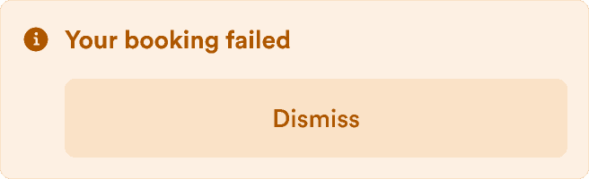
Critical badges
Critical badges call attention to problems that require immediate attention from the user. These badges create feelings of stress so only use them for issues where they’re truly necessary.