When to use
- To group choices together under a single heading.
- To offer unified instructions for a group where users can either select one (with radios) or multiple (with checkboxes) options.
When not to use
- To present more than just a few options—use a select
Component status
Figma | React | iOS | Android |
|---|---|---|---|
Designing | Released | N/A | N/A |
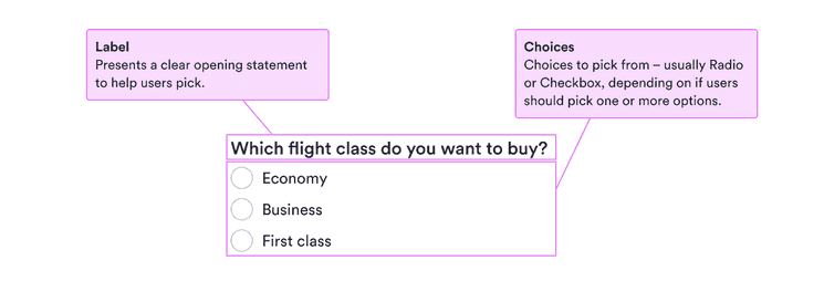
Content structure
Behavior
Use for closely related options
Choice groups override the settings of individual choices to present a coherent whole. This means they’re great for a few choices that make a single unit.
They’re not good at grouping many options, such as all countries in the world. For many options at once, consider using a select.
Content
Use labels properly
Labels serve to clearly present what the choice means for users. They’re especially important for people who don’t see other visual cues. But they also help everyone know exactly what to choose.
Follow the labeling advice for radios or checkboxes. In particular, make sure all the labels have a parallel structure.
Use helpful error messages
With more complicated choices, sometimes labels aren’t enough or sometimes the option the user wants isn’t available. Use clear, calm error messages when there’s a problem with a choice.
Remember that such messages are likely to invoke negative feelings, so be positive and focused on solutions to any problems.
Only messages you include for the choice group appear. Any messages for individual choices within the group aren’t shown.