When to use
- To add simple visual context.
- To clarify the purpose of a feature or draw attention to a commonly understood action.
- With text so the context is accessible to everyone.
When not to use
- For services such as payment methods—use a service logo.
- For carriers for transport—use a carrier logo.
- For general visual context—use an illustration.
Component status
Figma | React | iOS | Android |
|---|---|---|---|
Released | Released | Released | Released |
Content structure

Content
Use interactive icons for interactions
Some icons (like plus and close ) work well to show users that an interaction is possible (like adding an option or closing a dialog). Users are used to interacting with these icons, so they work well inside buttons.
Don’t use such icons in places where users can’t interact with them. This creates an expectation that clicking them does something, which can lead to users being frustrated when nothing happens.
Do
Use non-interactive icons for settings other than interactions.

Don't
Using interactive icons creates the expectation that clicking the icon does something.

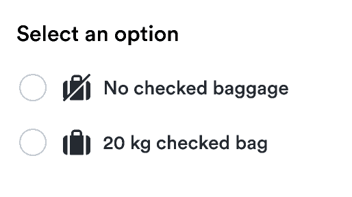
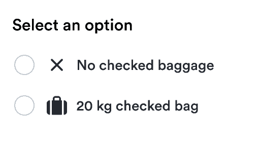
Use similar icons for lists
When creating lists and other repeated structures, make sure to use icons that seem visually consistent. For example, to show steps taken and not, use check-circle and close-circle to present similar visual cues.
Do
Using consistent icons keeps it easy to scan.

Don't
Varying the icons creates confusion about the message.

Use labels
Not everyone is able to see your carefully selected icon, no matter how perfectly its shape matches its meaning. Ensure everyone gets the same message by including a label with the icon.
The label should be short and match the meaning you want to convey with the icon.
You don’t need labels when the icon is just visually supporting a message that exists in text. In such cases, you should hide the icon from assistive technology.
See how it’s done in React:
Look & feel
Match the color
You can usually have icons inherit their color from the surrounding text. If you need a standalone icon, select from a status color or one of our icon colors: