When to use
- To add simple visual context so users can see at a glance the logos of carriers involved in their journey.
- With the carrier name so the context is accessible to everyone.
When not to use
- For services such as payment methods—use a service logo.
- For general visual context—use an illustration.
Component status
Figma | React | iOS | Android |
|---|---|---|---|
Released | Released | Released | N/A |
Content structure
Content
Include non-visual information
Logos can create important context for users, but not everyone sees the logo. So make sure everything necessary is presented in a non-visual form.
This can mean including the name of the carrier with the logo so anyone who doesn't see the logo still gets the name. But if the logo is present next to text with the name, don't include the name with the logo so it's not repeated.
Look & Feel
Multiple logos
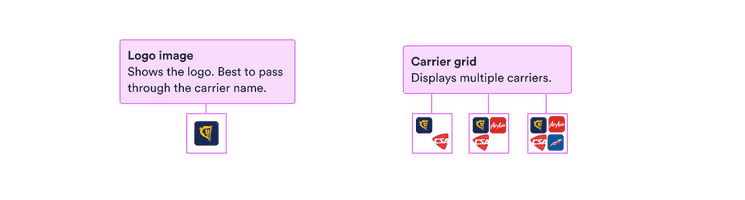
Carrier logos can include up to four logos at once. With one logo, by default it occupies the entire space. With multiple logos, the logos are shrunk to the same size (no matter how many more there are).
To create visual balance, the logos are positioned differently depending on their number. With two logos, they’re in the top left and bottom right. With three, the second logo shifts to the bottom left and the third is present in the top right. With four, the logos take up all four corners.
Optionally, it’s also possible to display all logos inline, slightly stacked on top of each other. In that case, the size of each logo is bigger, as if there was only one.