When to use
- To group multiple input fields for related information such as a date of birth with a day, a month, and a year.
- To label and validate the group as a whole, rather than just individual fields.
When not to use
- For information that can’t be presented as a single unit—use the appropriate field for the data type, such as:
Component status
Figma | React | iOS | Android |
|---|---|---|---|
Designing | Released | N/A | N/A |
Content structure
Behavior
Use for closely related fields
Input groups override the settings of individual fields to present a coherent whole. This means they’re great for a couple of fields that make a single unit.
They’re not good at grouping many fields, such as everything that goes into building an address. For those cases, use visual spacing, logical headers, and other structure to make it clear what fields are related. See more about designing forms.
Content
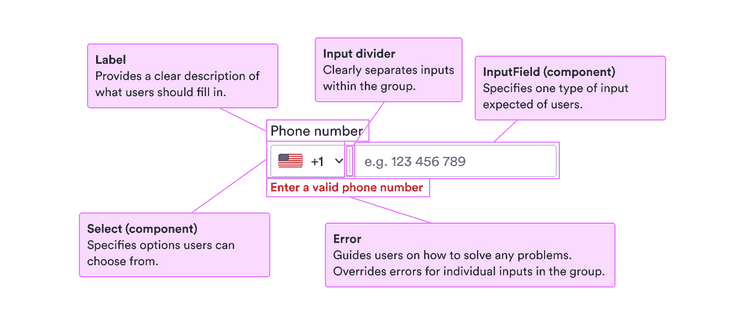
Use labels
Labels serve to clearly present what’s expected. They’re especially important for people who don’t see other visual cues. But they also help everyone know exactly what to enter.
For the label, use short descriptive phrases, ideally nouns that make the request clear. See our patterns for form labels for some examples.
Use error and help messages
For more complicated fields, sometimes labels aren’t enough. You want to include any necessary information as clear as possible to help users complete the fields.
Use help messages to guide users before they enter anything and clear calm error messages when there’s a problem with what they entered.
Remember that such messages are likely to invoke negative feelings, so be positive and focused on solutions to any problems.
Error and Help messages
Include placeholder examples
When you have additional information or helpful examples, include placeholder text to help users along.
Remember that placeholder text is visually less important, low in contrast, and disappears once users enter anything. So do not include anything necessary to complete the field.
The placeholder text must be added to each field, rather than the input group as a whole.
Look & feel
Background color and borders
See why background and borders for fields differ between app and website versions.