When to use
- To enable users to focus on a few items at a time.
- To make it clear there’s more to explore when ready.
- For large collections of items.
When not to use
- For only a few items—keep them all on one page.
Component status
Figma | React | iOS | Android |
|---|---|---|---|
Designing | Released | N/A | N/A |
Content structure
Behavior
Use for many items
Pagination is great at breaking up large numbers of similar items into smaller groups. You don’t need to hide items behind pages when they can all fit in a single manageable view.
Generally, use pagination if you have more than 25 or so items to display.
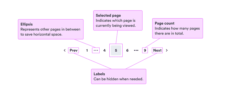
Ellipses
When the number of pages gets too large, displaying them all would be overwhelming. So if the total page count is 8 or higher, the pages appear compactly. Ellipses replace some pages so a reasonable number are shown.
Disabled buttons
While we generally recommend against using disabled buttons, they’re used in pagination on the first and last page. If the buttons were hidden, it would cause the other ones to jump around on the page.
With all of the other buttons next to the disabled one, it should be clear enough to users what they need to do to enable the button. So in this case it should work without major issues.
Look & feel
Responsive design
In small spaces, a list of pages would take up too much space. So for small screens, the complete list of buttons for each page is hidden. Instead, only the current page and total page count are shown with the previous and next buttons.