When to use
- You have long sections of content with similar structure.
- You want to organize it into related groups.
- You want to show all the content at once.
When not to use
- You want to display only one section at a time—use an accordion.
- There is a single action applying to all the content—use a tile.
- You want to hide simple information at first—use a collapse.
- You have many sections with little information in each—use a table.
Component status
Figma | React | iOS | Android |
|---|---|---|---|
Released | Released | Released | Released |
Content structure
Behavior
Use as the main content container
Because of its white background, a card highlights your content against a gray background. This helps divide your content into logical sections and make it clear what’s related.
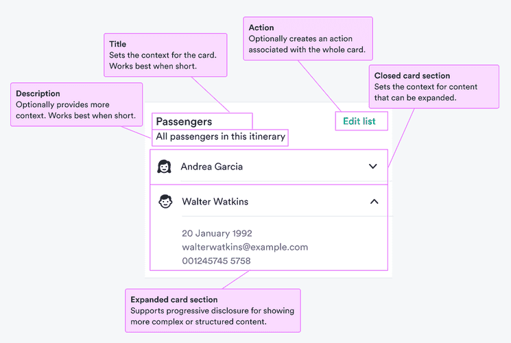
Content
Keep descriptions for extra information
Users sometimes skip descriptions so make sure there’s nothing essential in them. If you need to say something really important, use an informational alert.
Use sections for content types
When you have different types of information or just multiple examples of the same kind, use card sections to divide it into clearly related ideas.
For example, you might have a card about a passenger where you need to split personal information from baggage or other services. Or you might have a card with all passengers in an itinerary and you want to divide each passenger into a different section.
Look & feel
Maintain visual hierarchy
Cards are open to any content you want to put into them. If you're putting a heading into a card, we recommend using the card title, which was designed for this purpose. Or at least use the same style of heading to keep the overall visual hierarchy.
Using different styles can create conflicting visual messages, especially if you're using multiple cards on the same screen.