Overview
Alert is used to communicate important information or feedback to the user. It is designed to grab the user’s attention and convey a specific message in a clear and concise manner.
Usage of the component
When you want to interrupt a user’s journey with relevant information.
For things like status messages and additional explanations.
When there are already many on the screen. Don’t overwhelm the user.
For temporary messages that don’t draw much attention—use a toast.
When no results match a user query—use an empty state.
When a user has to solve an issue as soon as possible—use a modal.
Component playground
Look & feel
Component structure
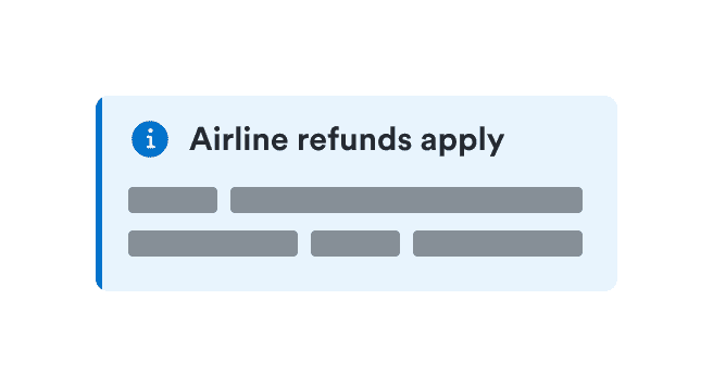
- Title
Works best with 5 to 8 words (in English).
- Icon
Optionally supports the message.
- Description
Optionally provides more context for the message, usually when the message is long.
- Actions
Optionally adds related actions for users to take.
Alert types
There are four types of alerts: informational, success, warning, and critical.
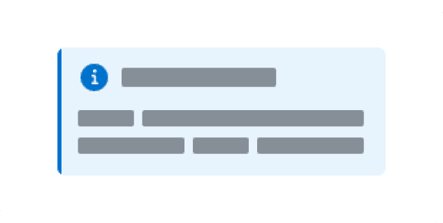
Informational alert
Informational alerts are the most common alerts. Use them to guide a user’s attention to relevant details, but keep it focused and related to the topic on the screen.
Success alert
Success alerts confirm that an instruction from the user, such as to make a payment or request a refund, was processed successfully. Usually used without an action button.

Warning alert
Use warning alerts when you need to inform users about a potentially unfavorable situation that requires eventual action from them. If the issue requires immediate attention, use a critical alert.

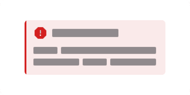
Critical alert
Use critical alerts when something is blocking users from continuing or an issue needs to be resolved immediately. The alert should offer a solution to the problem.
Guidelines
Explain the alert
Explain why the user was interrupted—confirm the action that will happen or describe what just happened.
Keep it clear, short, and simple. Alerts break the user flow, so you want to explain why with as few details as possible.
For longer messages, use a title for quick info. The user sees the title first when scanning the message. You can also provide additional context for the alert by adding a description. For more complex messages, let users access more information through an action button.
Provide context
While using Alerts it is important to provide context, so the user know directly from the title what is the message about.
Do
Don't
Follow up with actions
There are times when just simple information isn’t enough and the user needs to take additional steps to resolve the problem or get additional details.
In such cases, provide additional actions for your message. Alerts use special status buttons to match the button color with the alert color. If you need to provide specific contextual links, insert text links directly intro alert description.
Use actions where needed
Use at most two actions in each Alert: one primary and one subtle. Always align both actions to the left. Primary action goes first.
Use more than just color
To maximize accessibility, make sure the message is clear from the content. Icons can also support the message.
Color alone doesn’t always distinguish different alert types.
Use icons
Without icons, people with color blindness might see success and critical alerts as the same. Add icons especially for warning and critical alerts.
Do
Don't