When to use
- To enable users to sign in with a trusted provider
- To shorten the time to access your services.
When not to use
- For any other action—check out our interactive guide on action components.
Component status
Figma | React | iOS | Android |
|---|---|---|---|
Released | Released | Released | N/A |
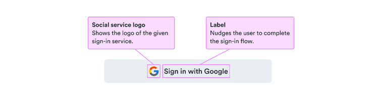
Content structure
Behavior
Use full width in small spaces
As with other buttons, social buttons work best as full length buttons on smaller screens.
Use only for signing in
Social buttons are designed to ease the flow for users signing in. Don’t use them in any other case or in any complex scenarios.
Content
Use actionable text
It should be clear from the button text exactly what happens when the user interacts with it. To make it actionable, the label should include the service name and the action text sign in.
Be sure to use the same text structure for all social buttons.
Look & feel
SocialButton services
Social buttons automatically display the logo for the selected service. See all available services below.