When to use
- To keep extra information off the screen but accessible (through progressive disclosure).
- To add context to a given screen.
- To add explanations to visuals such as icons.
When not to use
- For small bits of information connected to a single action—use a dialog.
- For large and/or structured content—use a modal.
- For small interactions or choices—use a popover.
- To add hidden information to the screen itself—use a collapse.
Component status
Figma | React | iOS | Android |
|---|---|---|---|
Released | Released | N/A | N/A |
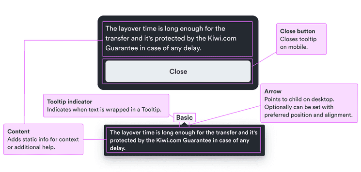
Content structure
Behavior
Indicate the tooltip is present
Tooltips are great for keeping information initially hidden. In order for users to access it, they need to know it’s there.
Use icons, the natural indication of underlined text, or pointing text like “learn more”. Whatever you do, make sure users know they can take an action to get more information.
Explain disabled actions
Although it’s best to avoid disabled actions, sometimes they can’t be avoided. And sometimes seeing them can encourage users to continue a flow. In such cases, users need to know how they can progress past the disabled state. A good way to do that is with tooltips.
Keep the text short and focused on the actions users need to take.
Do
Don’t
Stick to non-interactive elements
While tooltips can help explain disabled elements, they require an interaction. So don’t use them on interactive elements (such as a non-disabled checkbox).
Having multiple interactions on a single element can confuse users. Each element should have a single purpose.
Content
Keep it simple
Tooltips can contain any kind of content you want. You can include pictures, lists, and more.
Of course, just because you can do something, doesn’t mean you should. Tooltips have little space to show everything and too much at once can be overwhelming.
If you have a lot to say, consider including a text link to more information to continue the pattern of progressive disclosure. Or if you have structured information, consider a modal to present it all.
Look & feel
Desktop vs. mobile
Hovering over text is a natural user pattern on desktops. On desktops, users are used to seeing an indication there’s a tooltip and moving their mouse over it to learn more. So it’s natural to have the tooltip popup in context.
Users of mobile devices don’t have the same option. There’s also a lot less space on mobile devices to display tooltips next to text.
So on mobile devices, open tooltips look somewhat like small, black modals at the bottom of the screen. This clearly distinguishes them from the initial text while leaving enough context under the overlay. A close button is automatically included so users can easily get back to their main flow.