Sometimes it’s good to have a lot of choices. Other times it can be overwhelming (which is why Orbit is based around progressive disclosure). We have multiple options for presenting possible actions, including buttons, button links, and text links.
If you’d like some help with which component to use, try out this interactive decision tree. You can read about the reasons for the recommendations below.
Buttons
Our main buttons come in three sizes (large, normal, and small) and six types:
- Primary
- Primary subtle
- Secondary
- Critical
- Critical subtle
- White
Primary buttons
Best for the single primary action on the screen. Use them when you want to continue in the flow of the app.
Primary subtle buttons
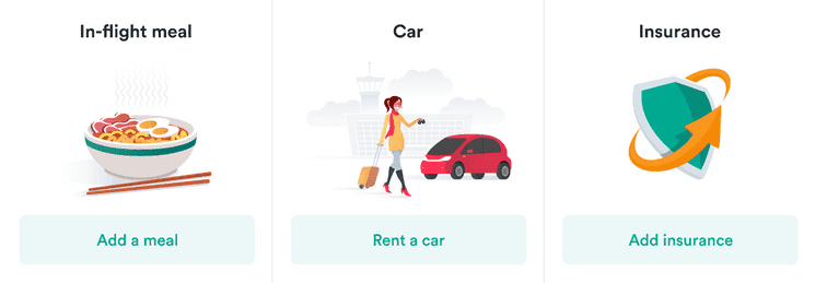
Also used for primary actions but those that do not directly push you to continue in the flow. They should be used when there are multiple primary actions on one page with the same importance.
Secondary buttons
Used for actions that aren’t so important. They’re usually connected to primary buttons.

Critical buttons
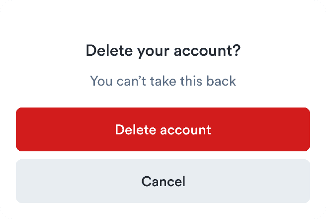
Used when you need to permanently delete something or have a critical action that can’t be taken back.
Critical subtle buttons
Used mainly as complementary buttons to critical ones. They’re often used as a step before permanent deletion, so they’re visually less important than critical buttons.
This is followed by a dialog confirming the deletion with a critical button (not a subtle one)..")
White buttons
Used in settings where the background is darker than usua and normal buttons wouldn’t work, such as a tooltip
Alert buttons
Alert buttons should be used only in alerts.
Each alert time has a basic button type (used in place of a primary button) and a subtle button type (used in place of a secondary button). There should be no more than one basic and one subtle button. (See alignment guidance below.)
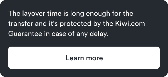
ButtonLinks
Choose a button link when it’s outside text, the text inside is short, and either of the following is true:
- The action navigates inside the app.
- The action is an interaction, like opening a modal or submitting a form.
Inside text and for external navigation, use only text links.
ButtonLinks come in three sizes (large, normal, and small) and three types:
Primary ButtonLinks
Great as complements to primary buttons or as a primary standalone action that’s visually less heavy than primary subtle buttons.
Secondary ButtonLinks
Great as complements to secondary buttons or as a secondary standalone action. Often used for filters.
Critical ButtonLinks
Great as complements to critical buttons or as a secondary standalone action that’s visually less heavy than critical subtle buttons.
This can be followed by a confirmation dialog with a critical button.
TextLinks
Choose a text link in any of these cases:
- The action is inside text.
- The action is less important and navigates outside the app.
- The text inside the action is long.
Our main TextLinks come in three sizes (large, normal, and small) and two types:
- Primary
- Secondary
All types can be external to navigate to external pages. These links automatically open in a new window with extra security attributes.
Primary TextLinks are used for primary actions inside of text (a paragraph).
Secondary TextLinks are used for secondary actions inside of text (a paragraph).
Button alignment
Primary buttons always appear to the right. Secondary buttons appear to the left of the primary button. Depending on the context, you can use primary subtle buttons on either the left or right side.
Button alignment in Alert
Standalone buttons should always be aligned to the left. If you have multiple buttons, align all buttons to the left. Primary buttons should be first and then Secondary buttons.
If the text in either of the buttons in a two-button layout is too long, the buttons get placed on separate lines.
The spacing between the buttons should be (you can do this with a stack component).
Button alignment in Modal
When there is only one action in Modal, se a primary subtle button aligned to the left. If there are two actions, use primary buttons on the right of the modal action area and Secondary buttons on the left.
Button alignment in Card
The Card action area is on the right of the header for both mobile and desktop versions. In this area, we recommend using only a small primary subtle button or a small secondary button.