When to use
- You have a lot of content that can be divided into separate tasks.
- You have related views.
When not to use
- You have many groups (more than, say, 6 tabs)—use a drawer.
- You want to connect content across screens—use a navigation bar.
Component status
Figma | React | iOS | Android |
|---|---|---|---|
Released | Released | Released | Released |
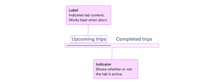
Content structure
Behavior
Keep everything necessary in one tab
While it’s important the tabs are related, it’s also key for their content to be separate. Users don’t want to be switching back and forth between tabs to get tasks done.
Make sure everything necessary to complete a single task is contained within one tab.
Limit the number of tabs
Tabs help to keep a lot of information in one context without taking up too much space. But having too many tabs increases clutter and can be overwhelming.
Try to have no more than 6 tabs at once to make the organization clear to users. If you have more categories, consider another component, like a drawer.
Content
Keep content similar
Tabs make sense when the content they contain is related. That includes categories within a list, one specific task, and parts of a user profile.
Don’t use tabs when the content isn’t related. Make sure it all makes sense within the overall context.
Make content clear
Users want to know what each tab contains before they switch to it.
Use short, clear names to set clear expectations. Aim for a single word when possible.
Do
Don’t