See also the general guidelines in Typography.
When to use
- To structure the UI.
- To add a clear hierarchy.
When not to use
- For decoration or emphasis (headings should represent semantic value)—use a text.
Component status
Figma | React | iOS | Android |
|---|---|---|---|
Released | Released | Released | Released |
Content structure
Content
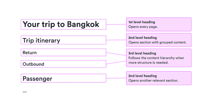
Stick to the hierarchy
Start with either a Title 1 or Display heading. Then use Title 2 and so on. Don’t skip around in the hierarchy or you confuse users.
Choose a Display heading for screens with lots of content and Title 1 otherwise. Generally, don’t use both on the same screen.
Do
Respect the hierarchy.

Don't
Don’t skip around and change the order of things with no reason.

Create semantic structure
Your beautiful visual hierarchy can be really helpful for those who can see it, but remember that not everyone is able to see it. Make sure everyone gets the benefit of your clearly structured content by using semantic tags (such as starting with h1 and continuing).
Look & feel
Heading types
Headings are split based on size and appearance into seven different types. These types represent a visual hierarchy from most important to least.
There is also one additional color for use on very dark backgrounds. This is the only color for headings other than colorHeading.
Use only a single color
While you might be tempted to make your headings stand out even more by using various colors, resist the temptation. Trust the visual style to make it clear what’s important and what isn’t.
In particular, don’t use our product colors (such as ProductNormal) to make headings more prominent. Those colors are reserved for actions users can take, so using them in headings may confuse users.
Do
Use the standard heading color.

Don't
Don’t use other colors for emphasis.